This month I decided to look into motor sport photography, as the Grand Prix has just started back up which I have to watch on a regular basis when home, as it is always on when I'm with Dad and/or Grandad. I think motorsport photography is so difficult to actually take due to the high speed of the motors, I feel that it captures everything in one image, for example proud reactions, the fast pace, the acceleration and heavy braking, you can feel everything thats happening in one photo. With this certain image I feel it is getting ready for race day, The grey colouring that is coming through the image I feel relates to the track called silverstone.
From now on with my interesting find's of the week, I will be using the staff picked videos of vimeo as I have a lot of work on at the moment with deadlines, unless I spot something awesome then you will all get an extra blog, just these video's they choose weekly are outstanding so I just wanted inspiration from pre-picked videos. The video this week is actually a song but the video is an animation music video made up of illustration, the soft transitions flow with the style of the song and the lyrics match what is going on behind, I feel this video is so creative and flows so well, it's simply outstanding.
My Book of the Month is the Pointless Book by Alfie Deyes aka. Pointless Blog. I loved this book as it 'is started by Alfie... finished by you...' It is so many different challenges, and everyday you can do a different task, this is what it looks like inside... I felt this book was really creative, and worked well with my thought process, when i've been feeling stressed I will complete another page, this is what the inside looks like, images courtesy of amazon.
The front cover.
The second page with your only instruction.
A journal section of the book.
The little iPhone imagery in the bottom hand corner, means the page is interactive with an app, created by Alfie and his team.
This is a double paged spread in which it has the instructions, and teaches you origami.
The film I am about to discuss is an 18 certificated film, called the conjuring, it is nerve-wrecking and more. If you are a wimp don't even carry on...
This week the film titles I am discussing is the work of Aaron Becker from Becker Designs who cleverly created the opening title sequence to 'The Conjuring' it is deep and dark, however the company which is helping with these blog posts every week... The art of titles luckily got an interview with Aaron, this is what was discussed...
'A discussion with Creative Director AARON BECKER, of Becker Design.
Give us a little background on yourself and Becker Design.
I studied graphic design at Washington University in St. Louis. After graduation, I worked at Prologue Films in LA and Digital Kitchen in Chicago. Currently, I run my own small studio in Chicago. We specialize in feature film main title design, entertainment branding, live action, and VFX.
How did you become involved with the project?
The director, James Wan, and I had worked together on his previous film, Insidious. We had a blast creating the look for that one, and luckily, he requested that we be involved on this one.
The first meeting we had was on the phone with Producer Rob Cowan. At that point, the film was still called “The Warren Files.” We discussed the premise — it’s based on a true story — of one of the cases belonging to paranormal researchers Ed and Lorraine Warren, most well known for their famously documented case, The Amityville Horror.
So, what kind of concepts did you begin with, after that call?
Rob Cowan sent us actual documentation from some of the Warrens’ past cases including photographs, newspaper clippings, and audio files. We built an archive of all this ephemera, a library from which to pull for a yet-to-be-determined concept. We discussed the fact that the Warrens are not only “demonologists,” but also researchers and educators.
The film opens with Ed and Lorraine giving a lecture about one of their cases at a university. They’re using a film projector, cutting between segments of the case. The real-life research component of the film was extremely important to the filmmakers and us, and we wanted to explore a concept that honored this trove of archival imagery.
The desire to use archival imagery triggered a conversation about microfilm readers. Newspapers, for example, were printed on small microfilm and projected onto a translucent screen, and the viewer could scroll and zoom into portions of documents. We did some rough motion tests for this direction just to get the concept across, but it wasn’t feeling quite right.
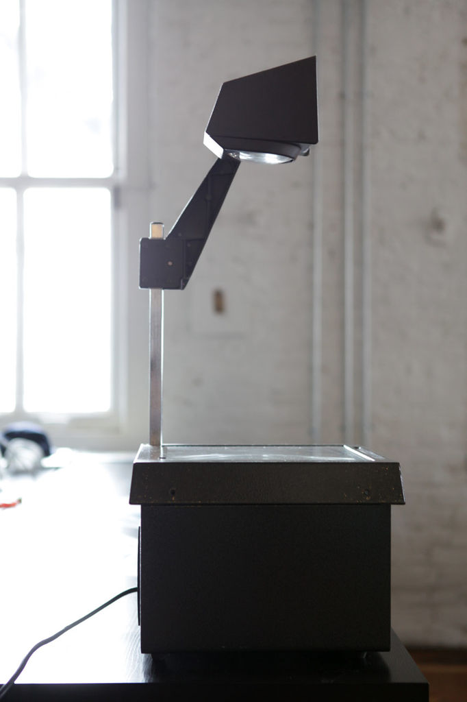
We wanted a true analog approach and this brought us back to that lecture hall at the beginning of the film. Because the film takes place in the ’70s, we concluded that the Warrens would have used an overhead projector for teaching.
Eiki Still Overhead Projector
We bought an old Eiki Still Picture Projector and it immediately brought back memories from childhood. Every classroom had one of these when I was growing up, and now we were getting to use it for an all live-action main title sequence!
Tell us about the live-action shoot.
For most live action titles, we prefer shooting on the Arri Alexa, the Red Scarlet, or Red Epic, but for this one there were different challenges. I thought about renting a Bolex and actually processing some of the film, but that was looking too expensive, not to mention unpredictable. We wanted it to feel a bit older and more analog, and because we were anticipating change requests from the director, we decided to shoot on a Canon 5D and experiment with the footage. This would allow us to swap out shots if articles or cards needed to be changed.
In order to get the shoot right, we needed to get our animatic approved. It consisted of a series of stills we designed so that the director and producers could sign off on layouts which we’d try to match on shoot day. All of the shots were of imagery projected on the wall.
Many of the title cards were made up of multiple layers of imagery, each printed on a separate sheet of acetate. So, for example, one Photoshop document would consist of three layers: one, an article; two, a photograph; and three, the name of a cast member. We would “turn” each page so that the layers would appear one at a time, and because we planned each composition, the type always fell in the appropriate place.
We also had a version of the edit that incorporated macro shots of hands shuffling sheets of acetate. Although we were liking the way this looked and felt, ultimately we were happy that we stayed with our wider shots.
What were some of your inspirations and reference for the look and feel?
Early on, we were certainly looking at the photographic compositions and archival approach used in the titles for The Game, which has an eerie, genuine quality. Although this had some influence, the inspiration truly grew out of the library of imagery and the fact that the film is a ’70s period piece. In our minds, the success of the sequence was down to our ability to create beautiful compositions and use technology consistent with the time period.
Can you talk about the pacing? It doesn’t feel rushed, and it’s something you see less of nowadays. The slower tempo makes it feel much older.
The intentionally slow pace was necessary for two reasons: firstly, so you could absorb the simplicity of the compositions and the content, and secondly, to scare the hell out of people! No card is trying too hard to impress the viewer — it doesn’t have to. We get the impression that anything can happen at any moment, and if you watch closely on some of the cards, things do happen. Joseph Bishara’s amazing score was the icing on the cake, as it helped establish the ominous, offbeat pace.
You also handled the main titles. Can you talk about that a bit?
One movie James Wan and I always talk about is The Exorcist. I have a collection of old movie posters that I try to revisit when I’m working on a period-inspired film, especially horror. James and I both love the typography and colors used in older films and film posters. The poster and title sequence for Rosemary’s Baby, which I believe was done by Stephen Frankfurt, is something I always look at as well.
James was pretty certain early on that he wanted a very simple title card scroll. Our job was to make the card feel like something that would’ve been designed in the ’70s. We created the custom look for “The Conjuring” title card and gave it a mustard yellow treatment. We played with many lockups but eventually landed on the one that felt most classic. One of my favorite subtle design decisions was how long we decided to extend the “J” so that as the card eerily scrolls upward, the letter momentarily feels endless. This lockup ended up working its way into the promotional branding of the film as well, which is always our preference for how a film should be marketed.
The New Line/WB acetate footage was something we showed the director before doing the main-on-end and he liked it very much, but we couldn’t get it approved for the final, so we ended up doing an alternate color treatment of the original WB/New Line animation instead.
And there was VFX work too, right?
Yes, we helped design one of the film’s demonic entities. James wanted very few features to be apparent on the face of the demon and that its form should have black masses of wispy tendrils.
Also, in another lecture scene, we aged footage to feel like 1970s films stock.
Was there anything that took you by surprise when working on this sequence?
At about 1:05 in the sequence, we lift up a sheet of acetate so that it’s perpendicular to the camera. Then we set it back down, revealing an entirely new image. We stumbled across this technique during our process, realizing that we could actually use this as a transitional moment between two cards. We didn’t want to overdo it, so we only used it once.
An accidental transitional moment
We also realized that some images would have to be inverted in post-production since it’s not possible to print white type on acetate. So anytime you see white type, we actually filmed the inverse of what you see.
How big was the production team, and what tools and software did you use to put it all together?
On the client side, we mainly worked with the director, James Wan, producer Rob Cowan, post-production supervisor Jason Leib, editors Kirk Morri and Dennis Alaniz, and composer Joseph Bishara. We also had the assistance of a great researcher named Richard Kroll.
In our studio here, I brought on a few talented designers and filmmakers: Nathaniel Costa, Matt Darnall, and Sergio Salgado. We used Photoshop to create our layered documents for translation to layered acetate and After Effects for editing and compositing. Hardware included the Canon 5D, the Eiki Still Picture Projector, acetate, and a printer.
What are some of your personal favorite title sequences, whether classic or contemporary?
There are so many to mention, so this is a tough one for me. My favorite title sequence of all time is Saul Bass’s North by Northwest. In terms of contemporary titles, I love Kiss Kiss Bang Bang.
How would you feel about a possible Best Title Design category at the Oscars?
This has been a dream of mine for a long time. The problem is what do we do about all of the great title sequences and designers that have come before us? We would need to honor them in some way before dignifying our contemporaries.
What’s exciting to you about doing this kind of work?
What excites me most about design is the ability to tell stories, regardless of what part of the industry one works in. My favorite part of working on a title sequence is determining what concept and execution best suits the film. Does it need live action or should it be graphic? If it’s a combination of those, then why? Searching for those answers is part of the process and although it can be daunting, I’ve been learning to embrace periods of creative stagnancy. Not forcing an idea is a skill unto itself, one that I’d like to get better at. It’s usually when I return to my work — after taking a break — that a series of conceptual bursts occur.'
Art of the Title. (2013). Conjuring. Retrieved from http://www.artofthetitle.com/title/the-conjuring/.
My flat mate recently returned from New York City, and is constantly reminding me of how amazing it was, this video basically sums up her holiday and I couldn't be more jealous. The beautiful city captured through the lens of a tourist makes it incredibly well produced as you are taken along the journey as if like a vlog (Video Blog). The scenery and architecture seen within is simply stunning.
Many people don't know but many people do, I am from Blackpool... My families business for the past 60 years was working a pitch of donkeys on Blackpool Beach, and I love them more than anything, they are the softest creature in the world and they can tell when something is wrong; they feel emotion. Unfortunately due to moving away to Huddersfield me and my dad packed up the business, as I started fully running it at the age of 16. My dad wanted me to go to university and made the hard decision to sell up due to not having anyone we could have to work the business, my uncle still works his side of the donkeys so I still get to see them, but these photo's were taken during my last summer of working the beach, and we had to go up to the field to sort out the donkeys hooves. As you'll be able to see donkeys (intact all animals!!) and camera's don't go well together!
So i'm pretty positive the majority of students across the world have the seen the amazing film, 22 jump street starring Channing Tatum and Jonah Hill, If you haven't yet seen it... watch it. Stop whatever your doing and watch it. Alma Mater is the creative mastermind behind the end slate which I can only describe in two words hilarious and clever. I have linked in the end titles for the film but please, please please watch it... * Contains language that some people may disagree with, if you do. Definitely do not watch the film...